


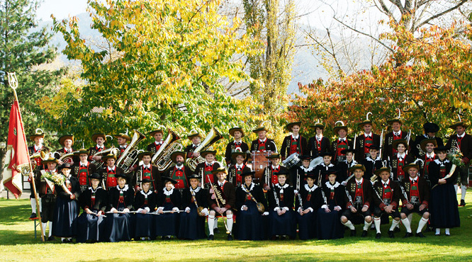
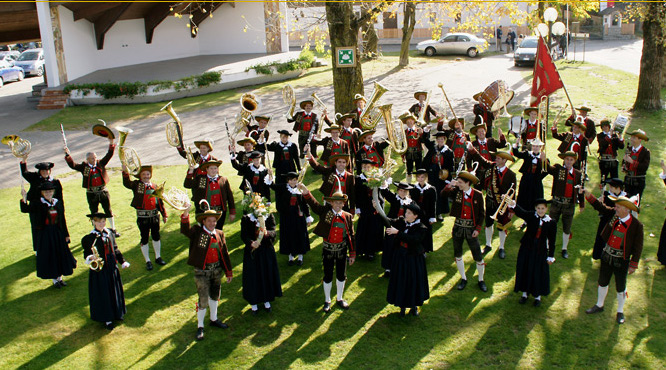
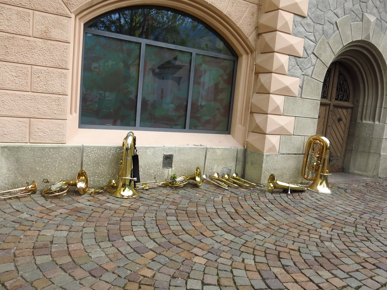
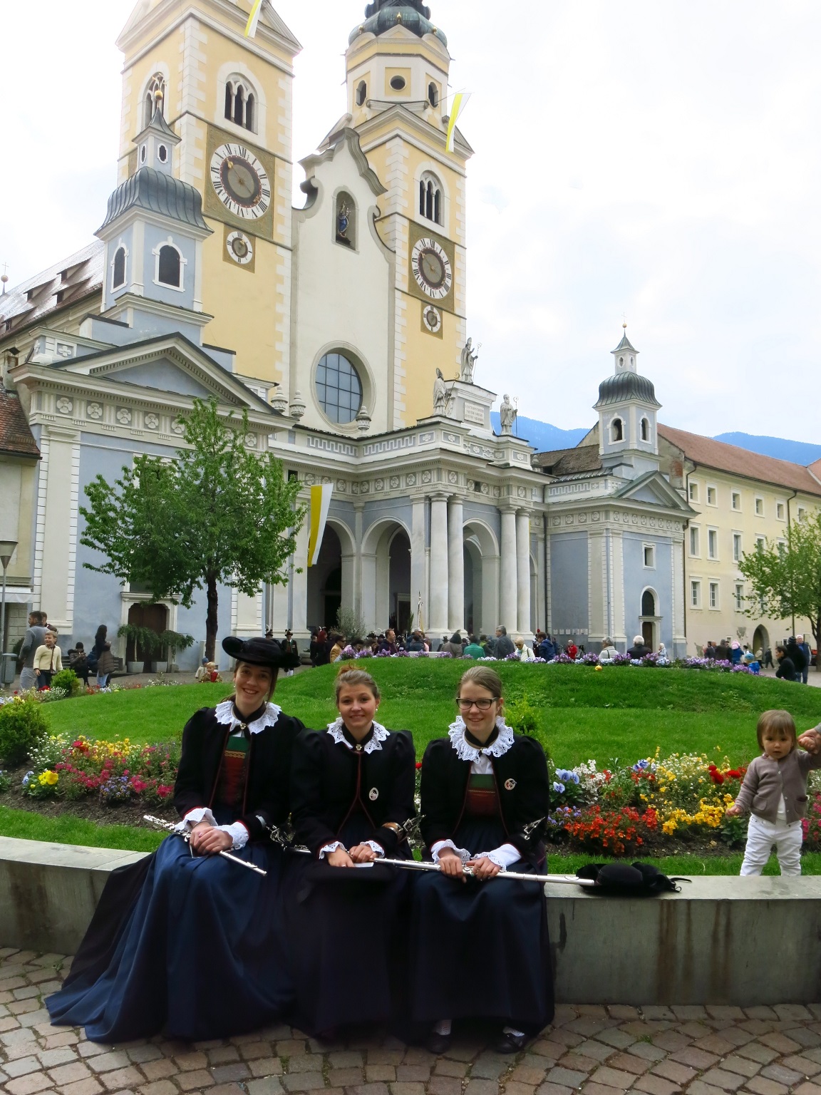
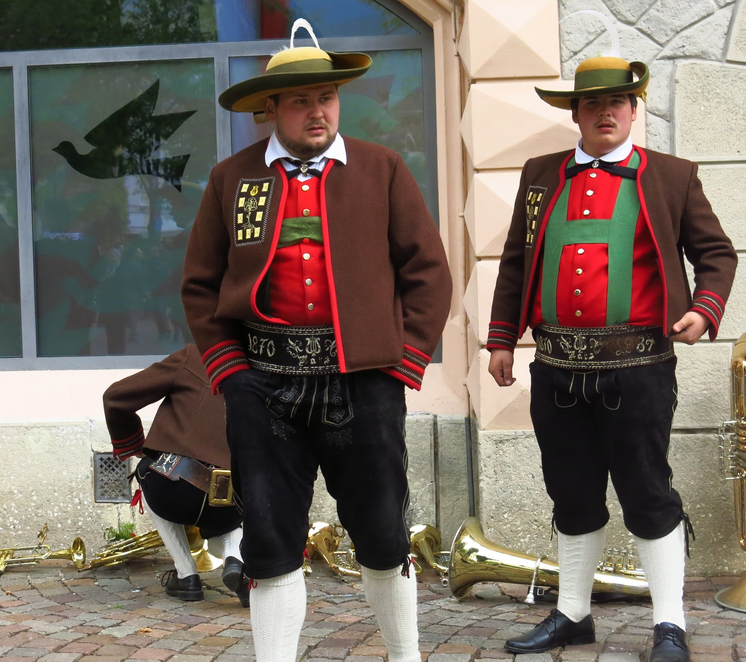
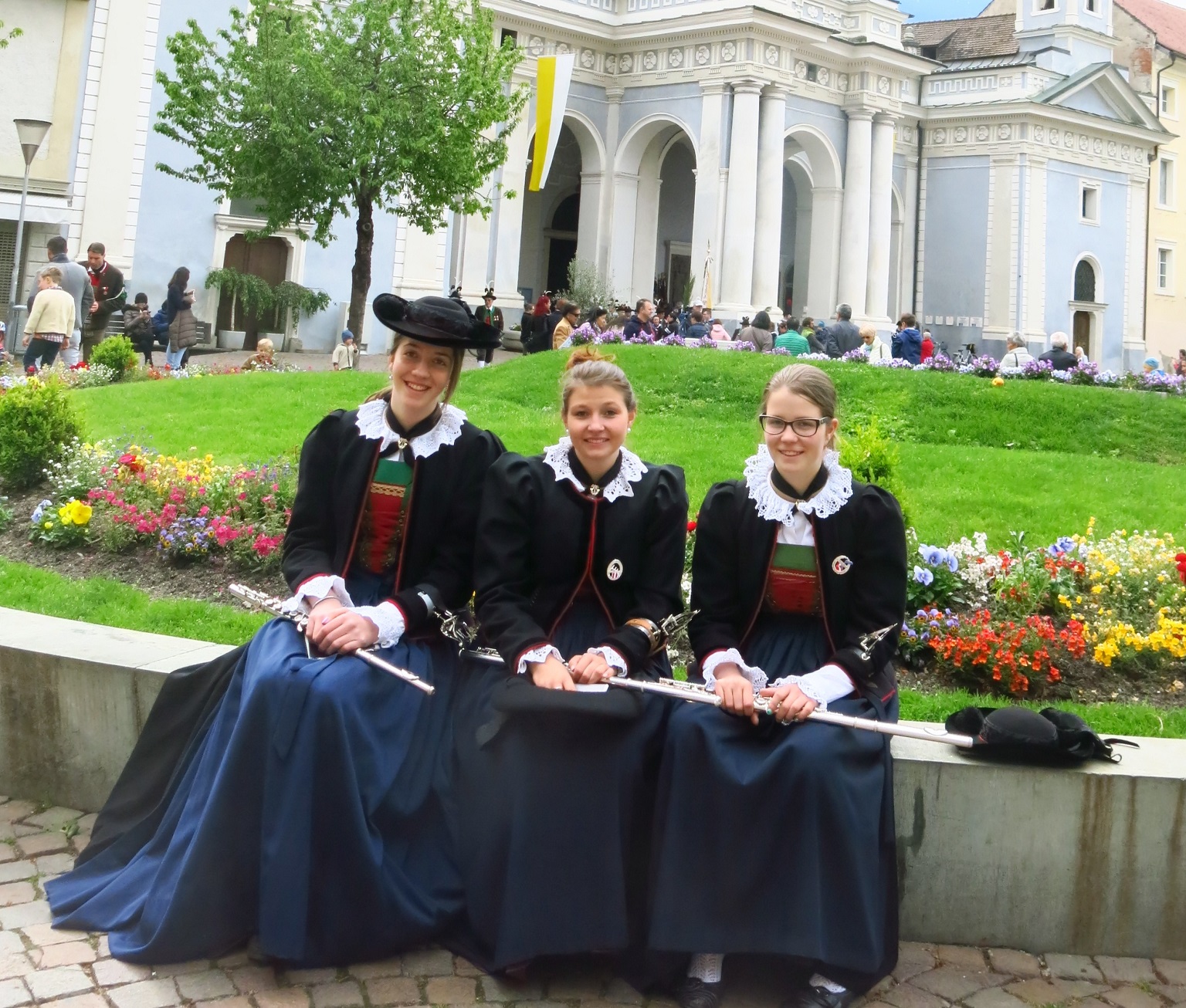
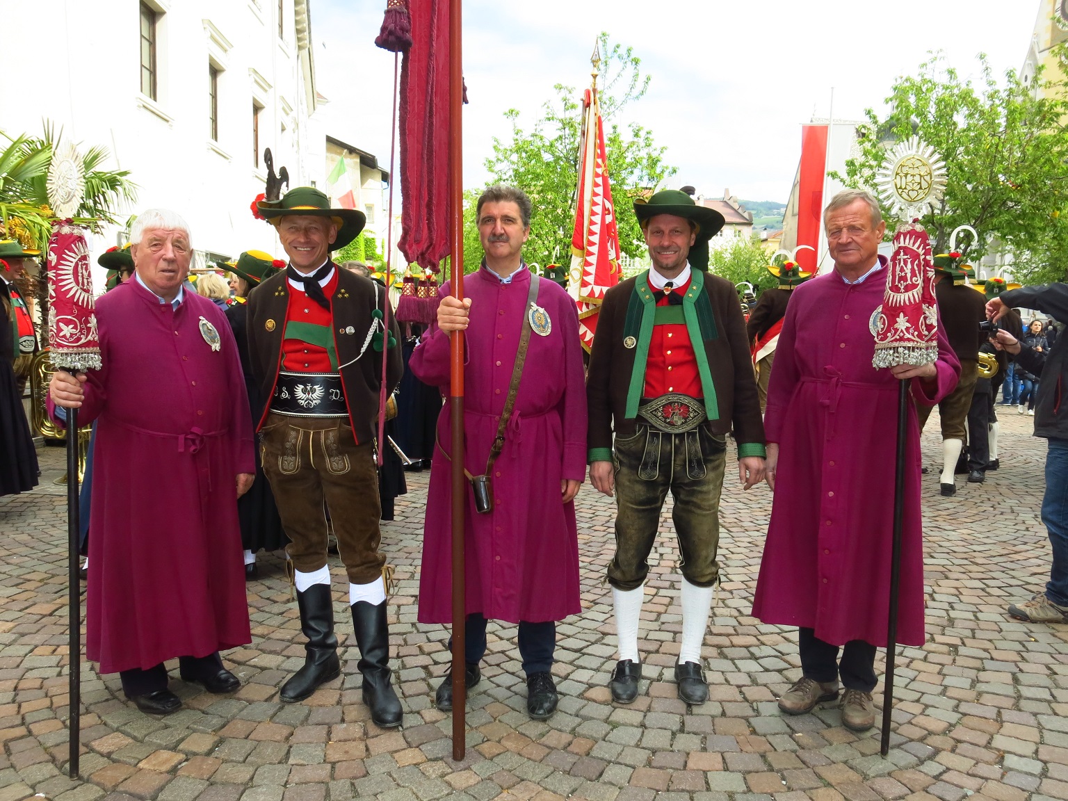
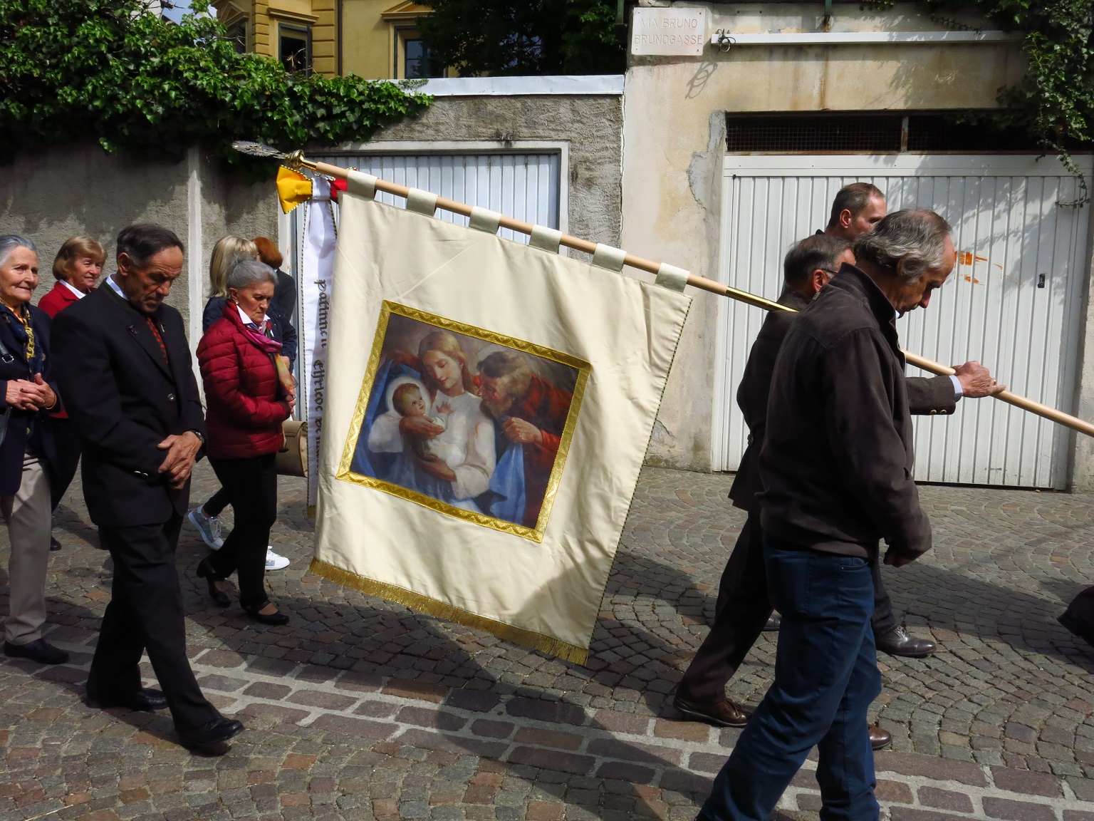
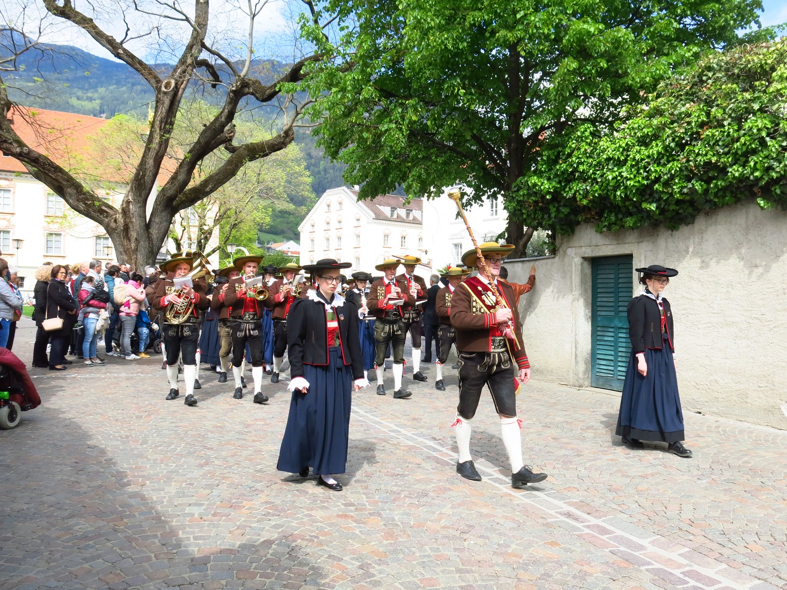
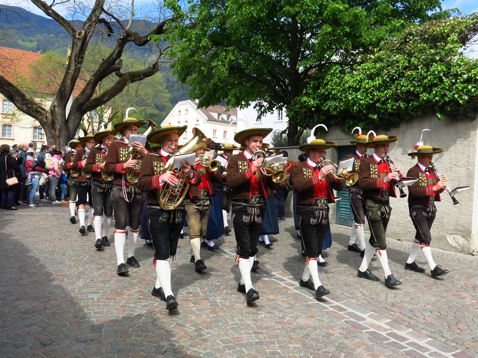
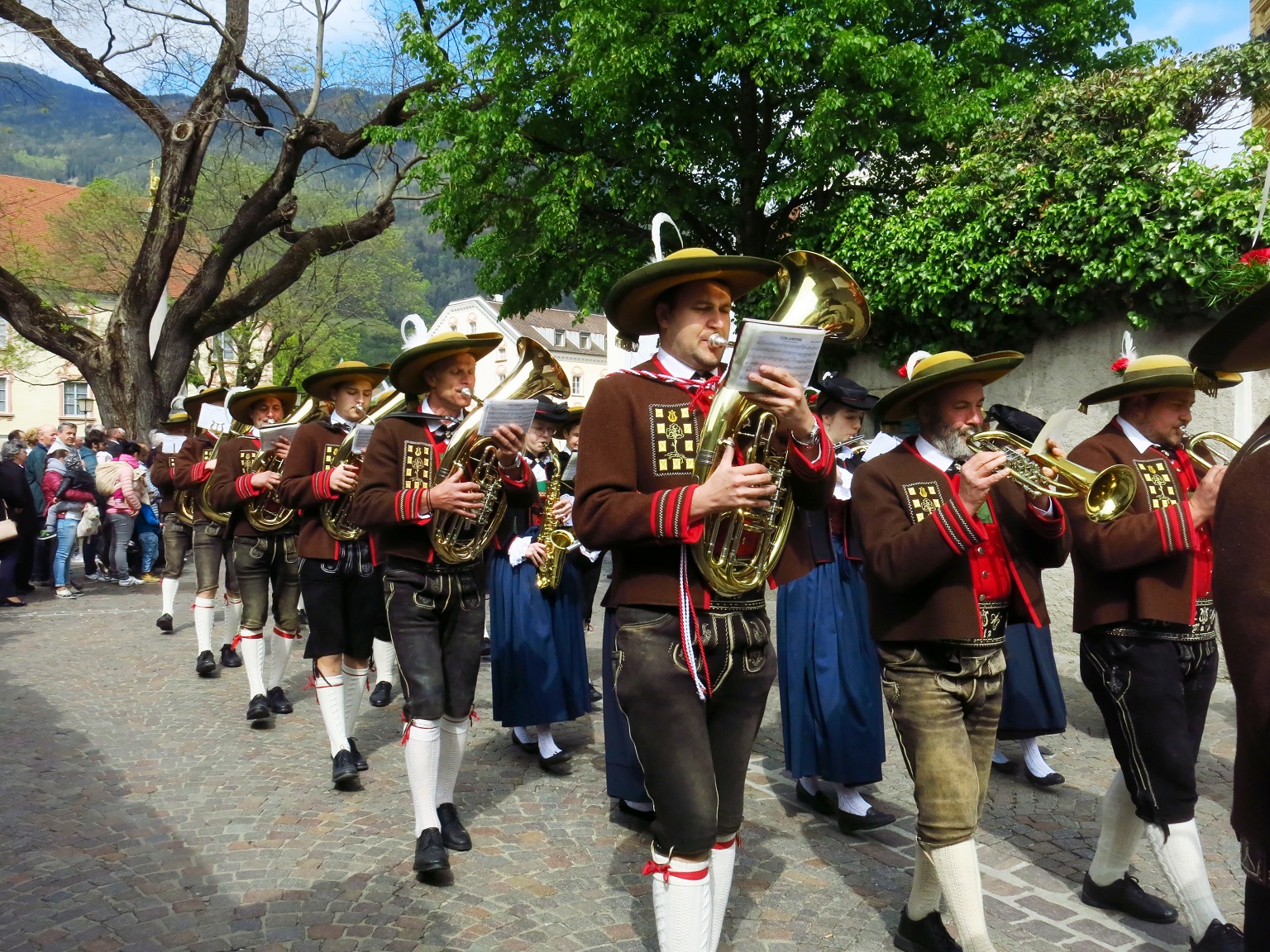
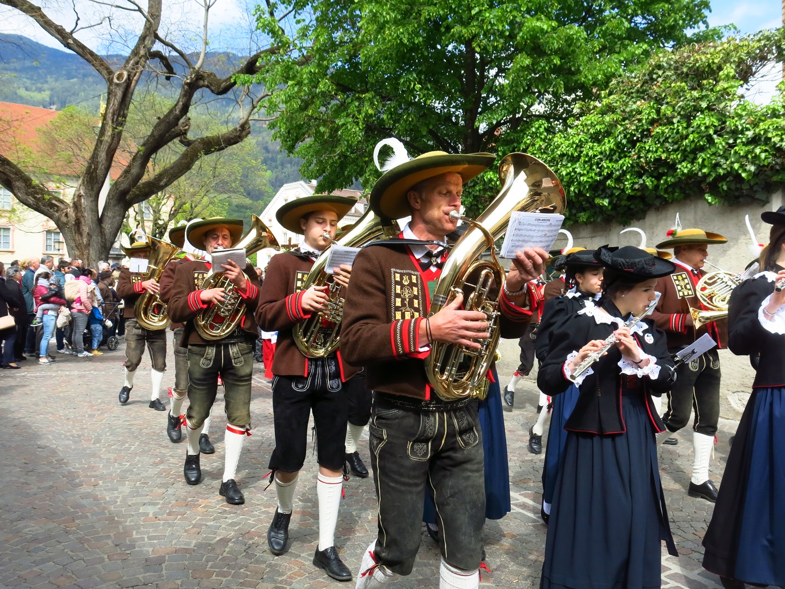
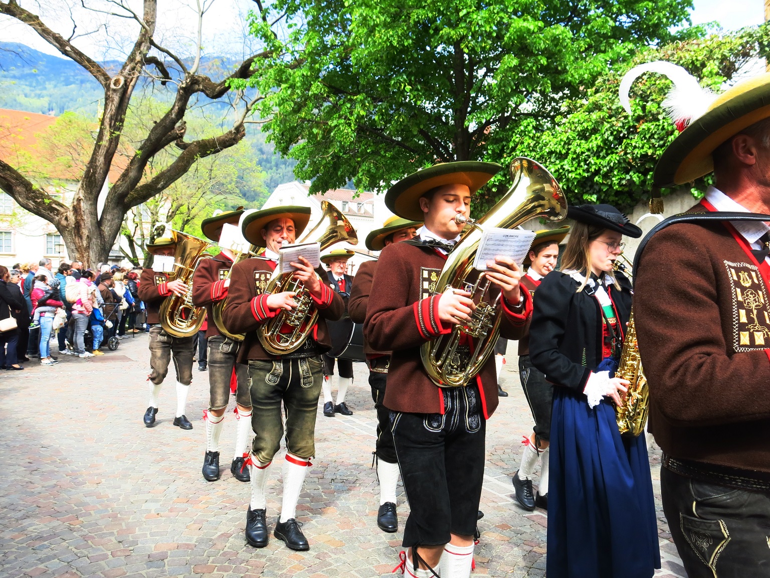
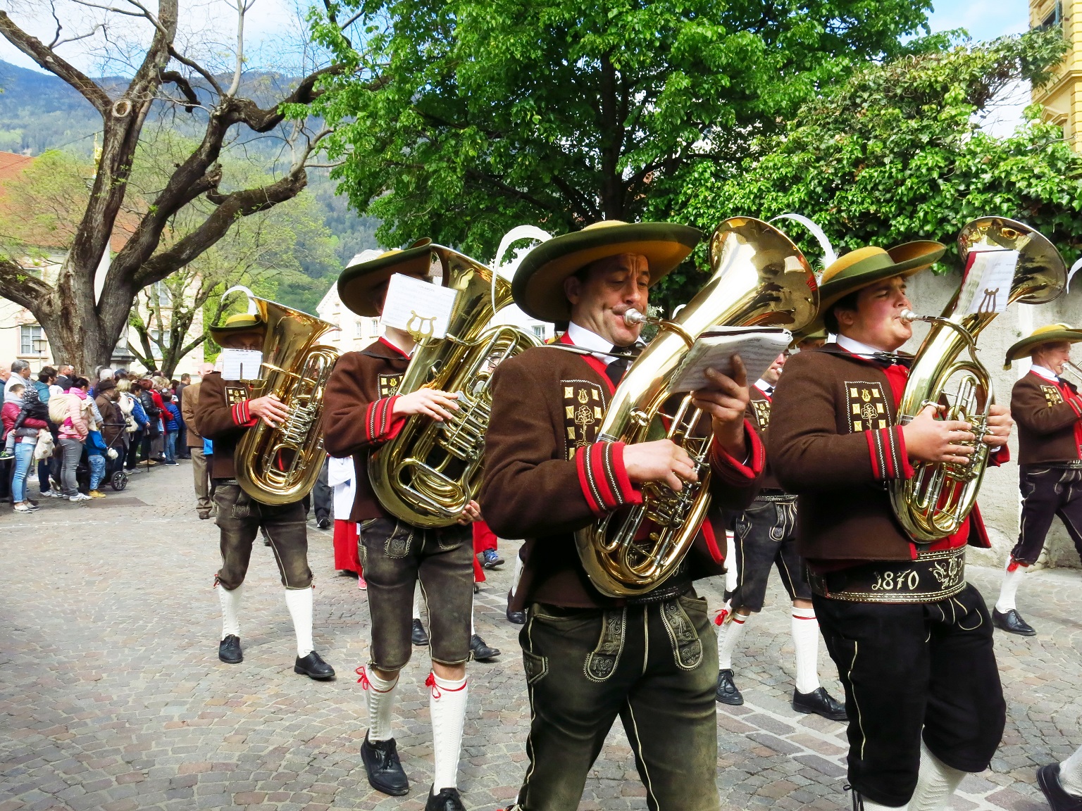
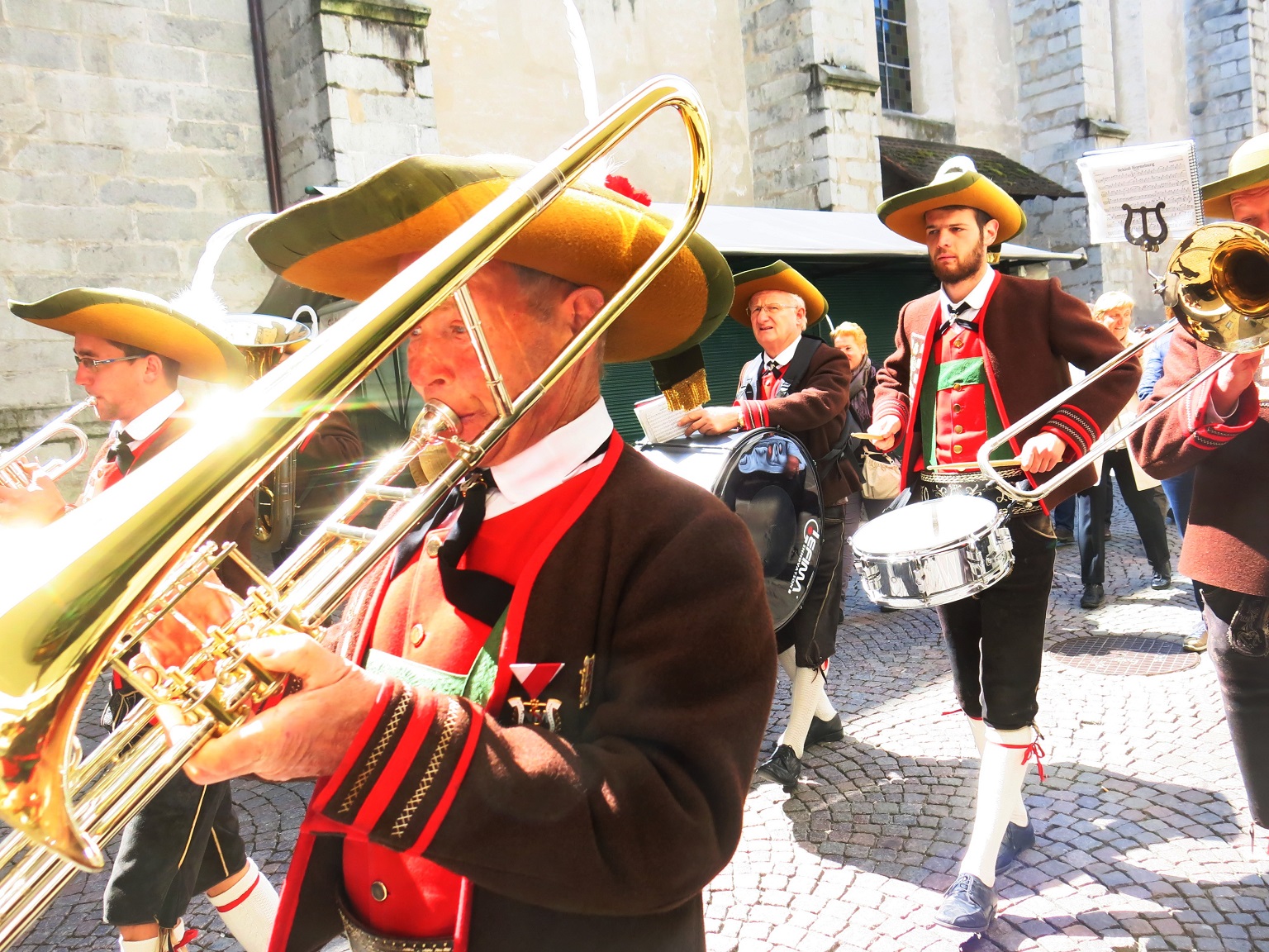
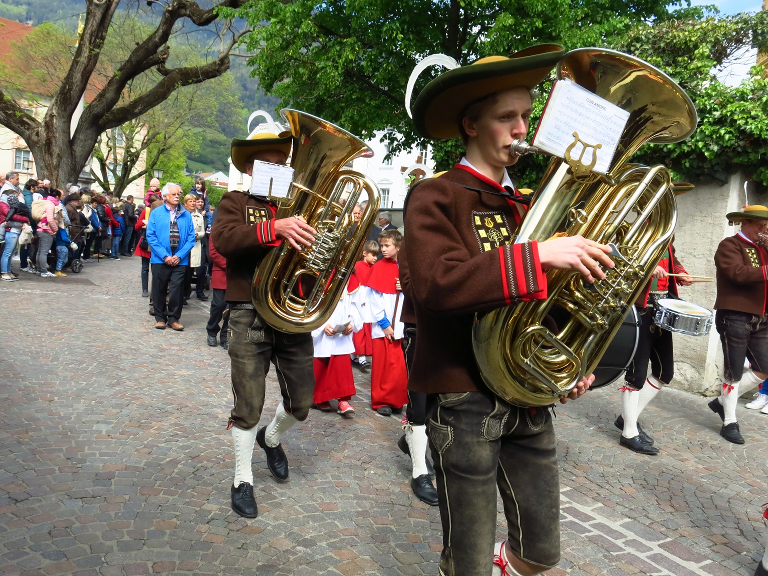
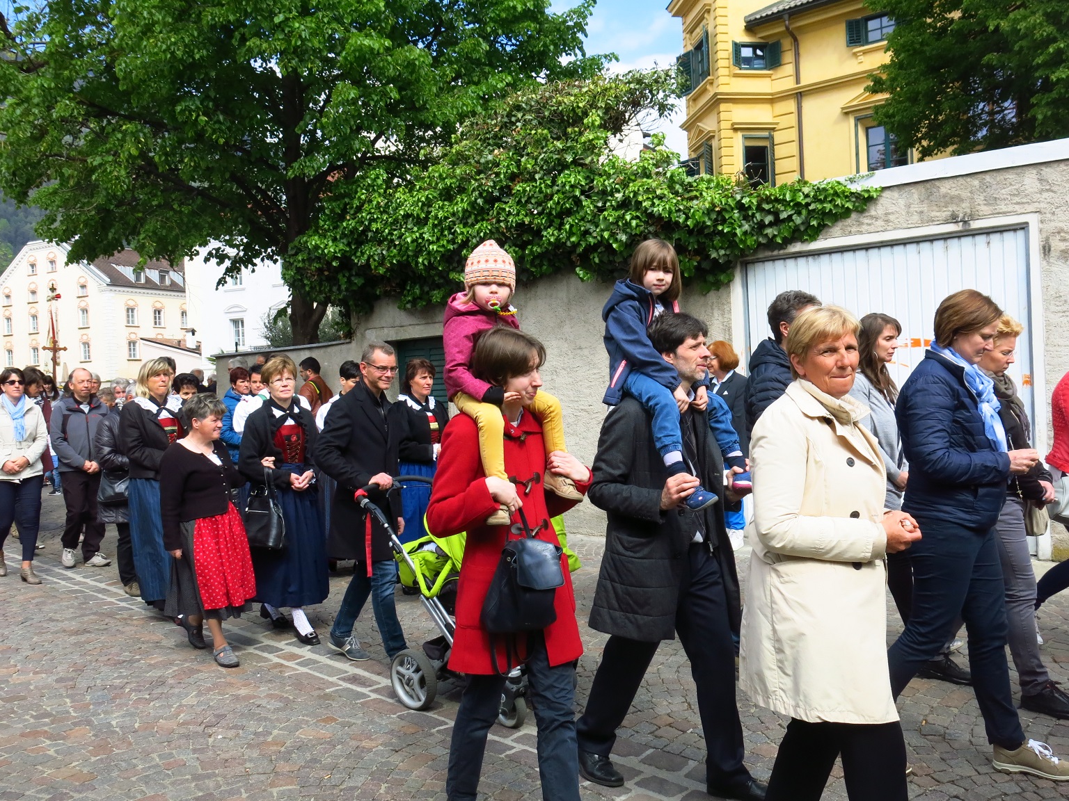
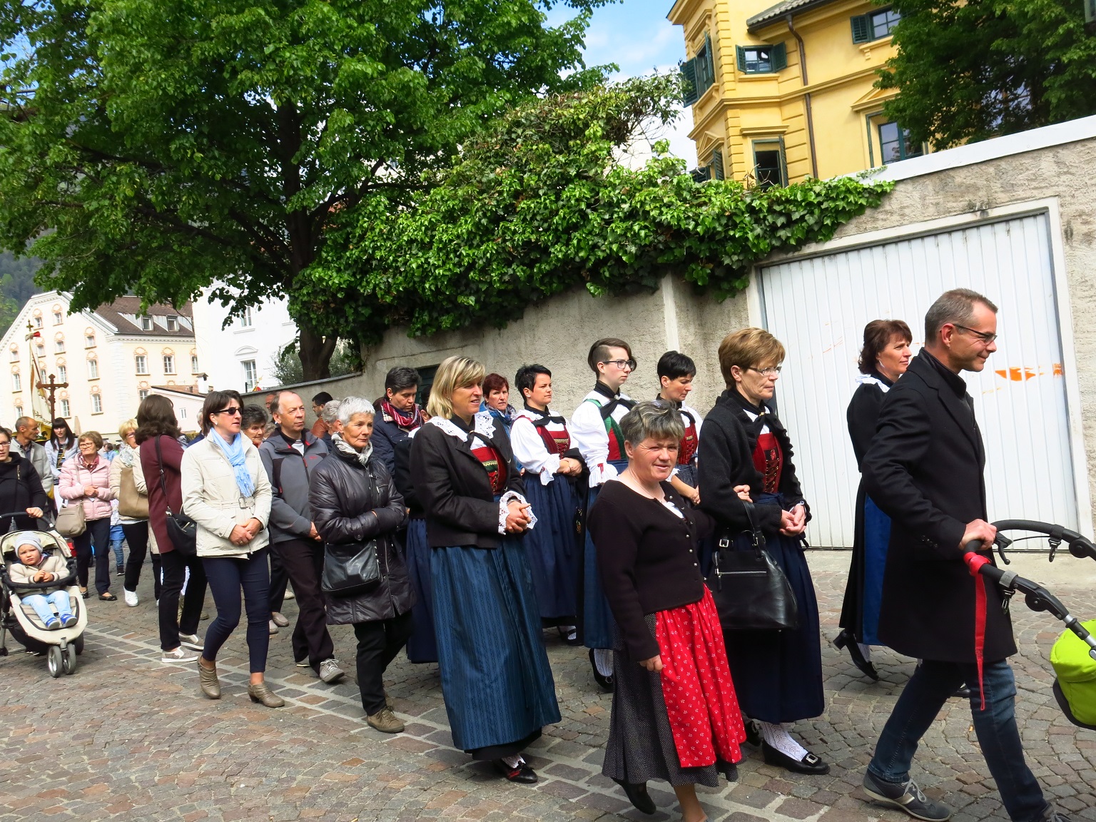
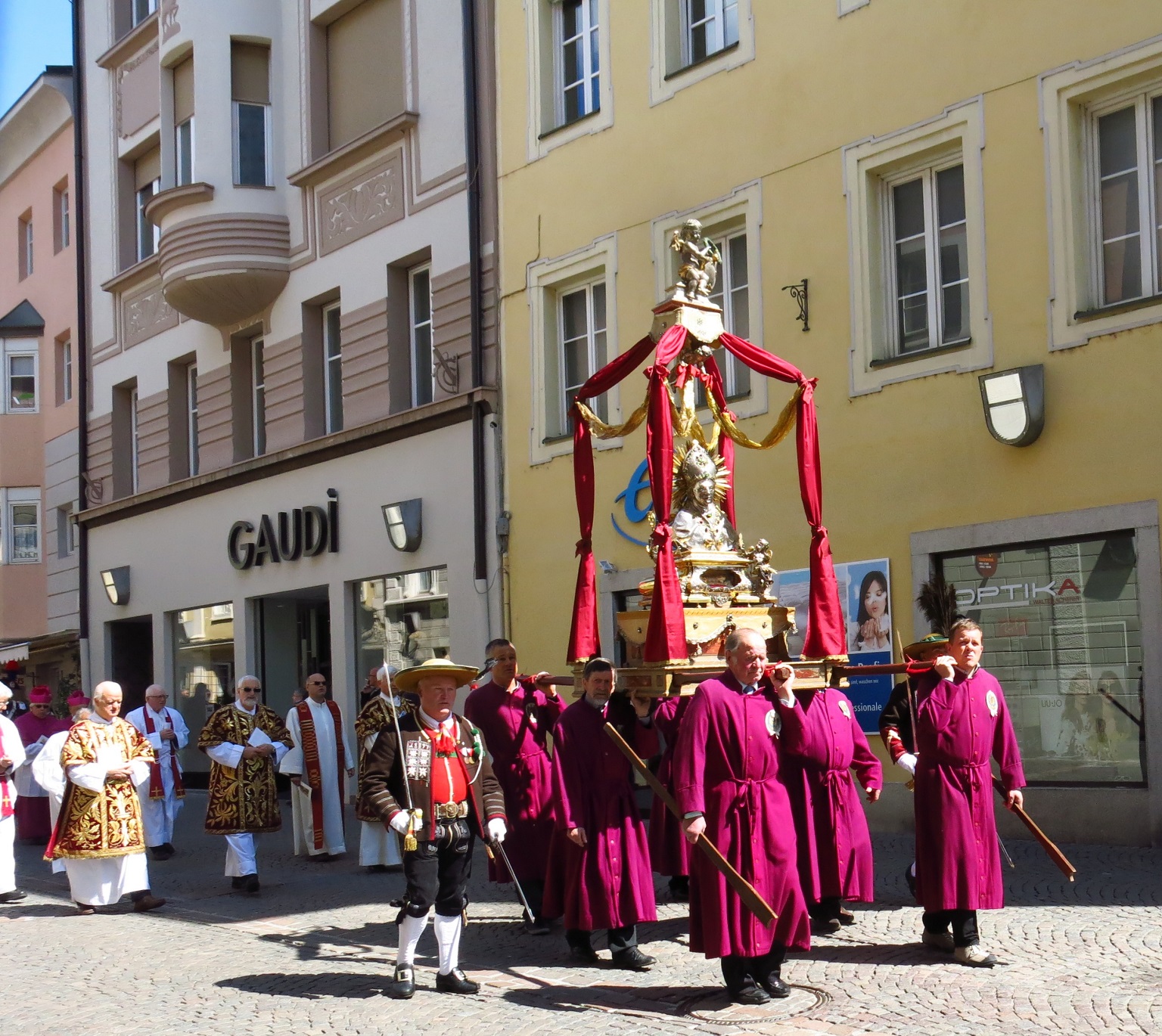
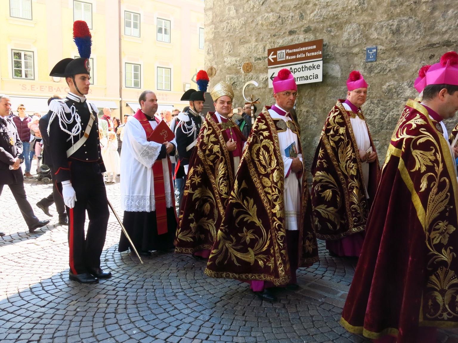
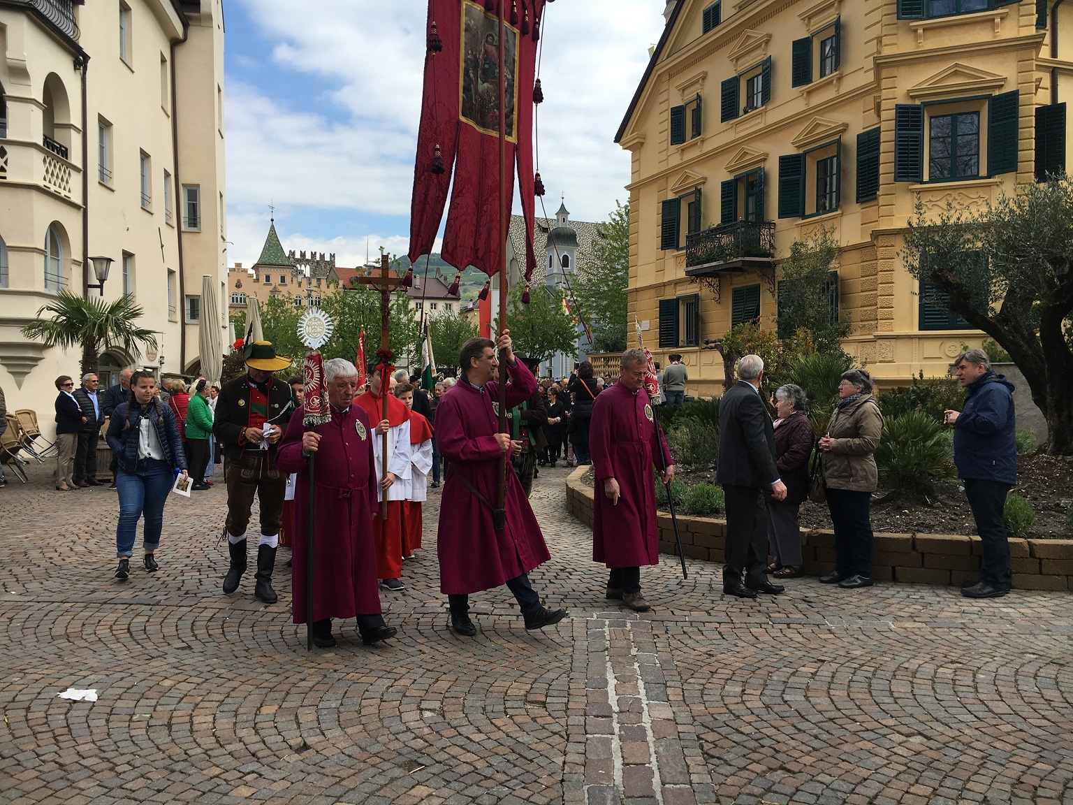
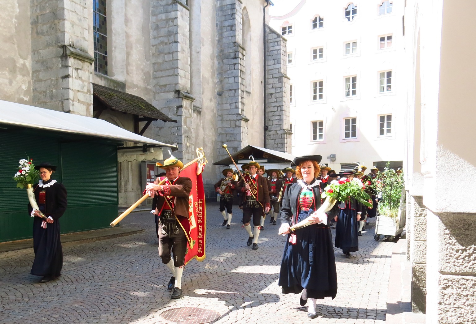
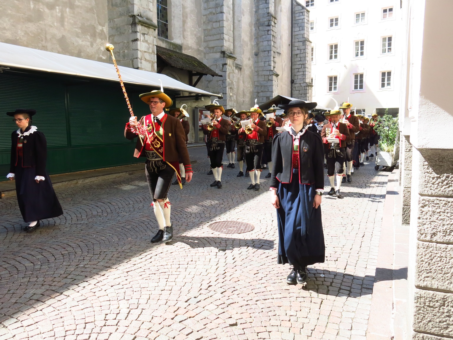
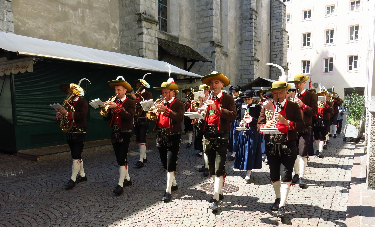
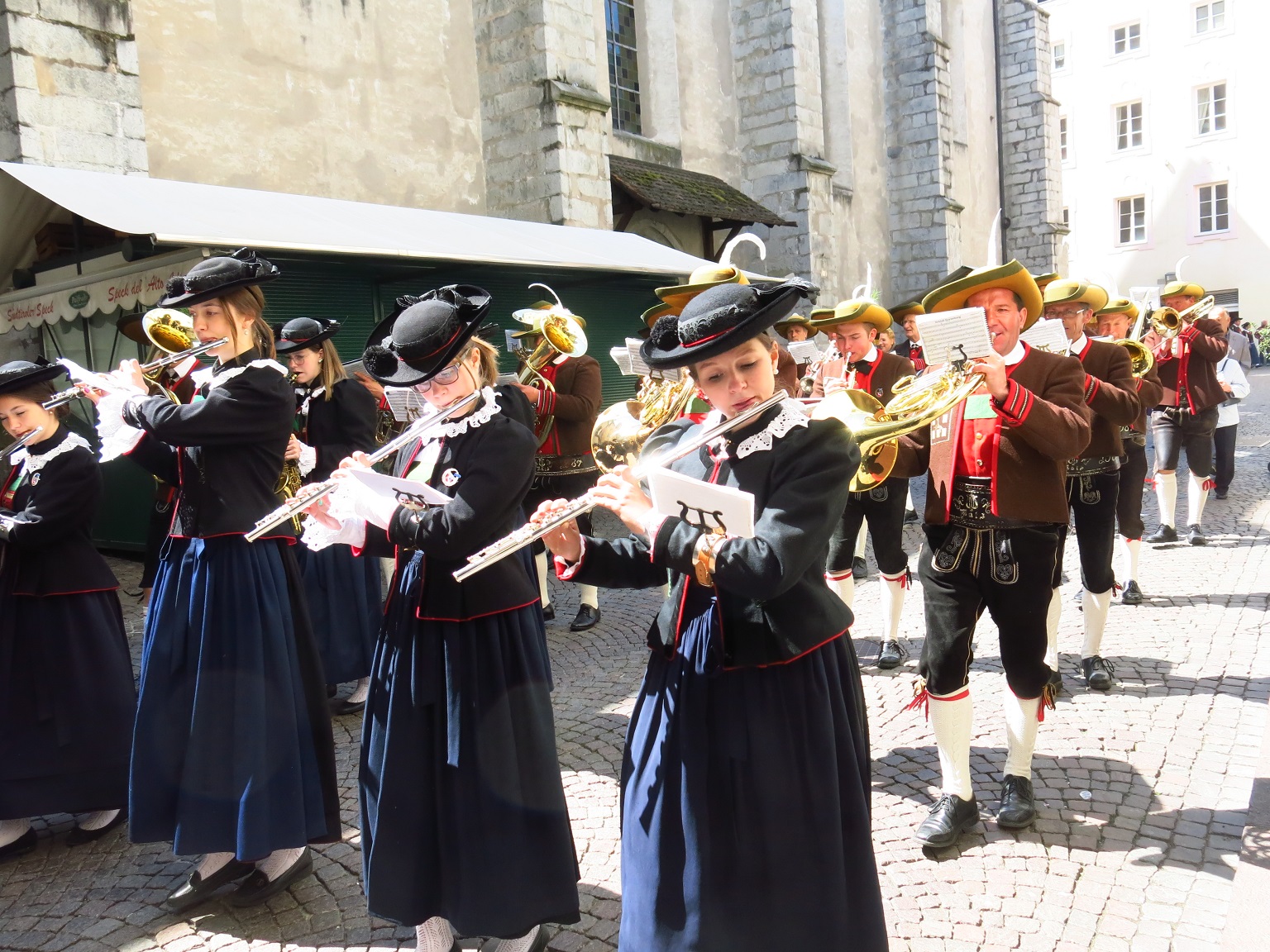
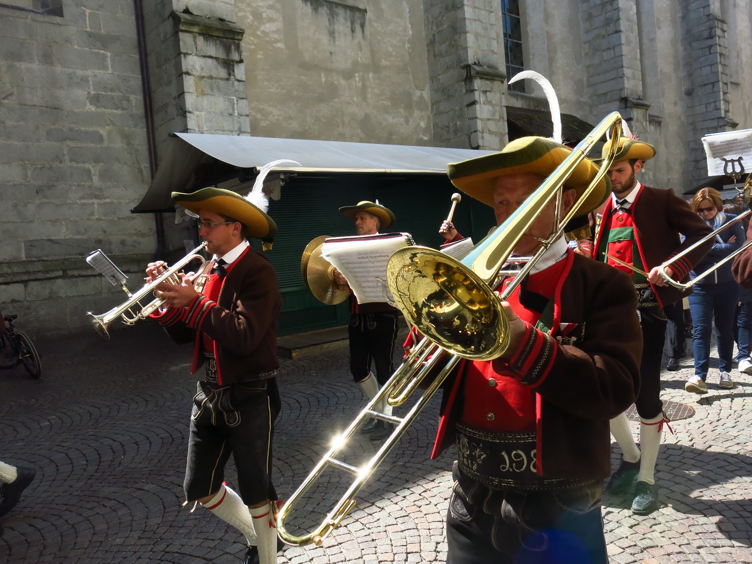
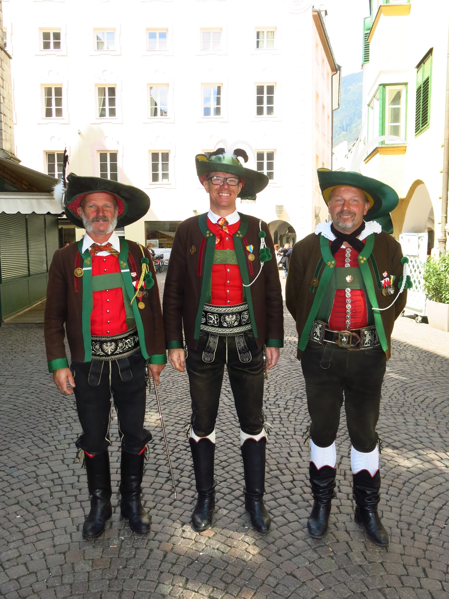
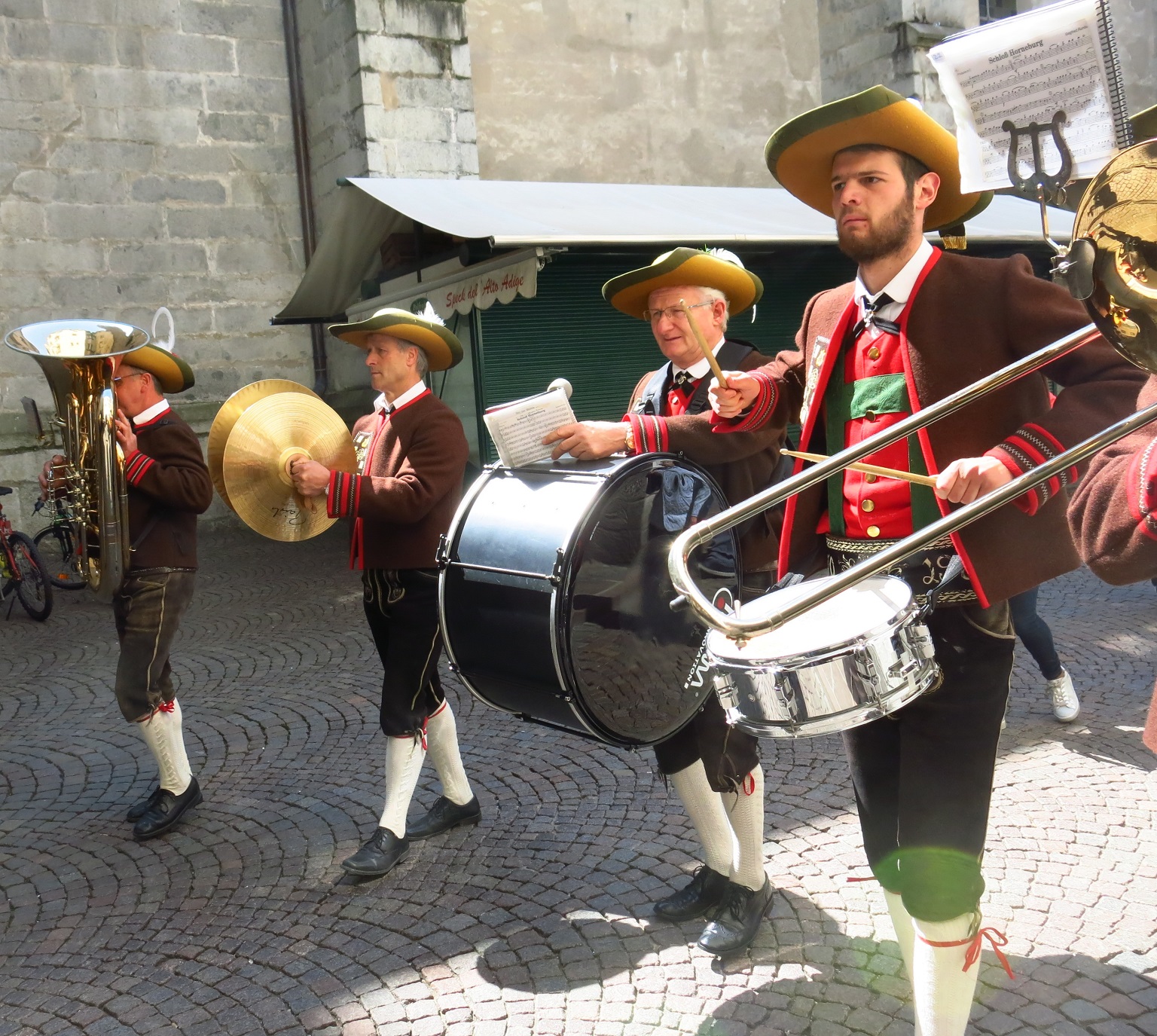
Kassiansprozession Brixen 2017


Kasiansprozession-2017
IMG_7274.JPG
http://www.mk-natz.eu/images/MK-2017/Kassians-Prozession-2017/IMG_7274.JPG
IMG_7292.JPG
http://www.mk-natz.eu/images/MK-2017/Kassians-Prozession-2017/IMG_7292.JPG
IMG_7268.JPG
http://www.mk-natz.eu/images/MK-2017/Kassians-Prozession-2017/IMG_7268.JPG
IMG_7283.JPG
http://www.mk-natz.eu/images/MK-2017/Kassians-Prozession-2017/IMG_7283.JPG
IMG_7294.JPG
http://www.mk-natz.eu/images/MK-2017/Kassians-Prozession-2017/IMG_7294.JPG
IMG_7328.JPG
http://www.mk-natz.eu/images/MK-2017/Kassians-Prozession-2017/IMG_7328.JPG
IMG_7512.JPG
http://www.mk-natz.eu/images/MK-2017/Kassians-Prozession-2017/IMG_7512.JPG
IMG_7518.JPG
http://www.mk-natz.eu/images/MK-2017/Kassians-Prozession-2017/IMG_7518.JPG
IMG_7526.JPG
http://www.mk-natz.eu/images/MK-2017/Kassians-Prozession-2017/IMG_7526.JPG
IMG_7530.JPG
http://www.mk-natz.eu/images/MK-2017/Kassians-Prozession-2017/IMG_7530.JPG
IMG_7534.JPG
http://www.mk-natz.eu/images/MK-2017/Kassians-Prozession-2017/IMG_7534.JPG
IMG_7536.JPG
http://www.mk-natz.eu/images/MK-2017/Kassians-Prozession-2017/IMG_7536.JPG
IMG_7538.JPG
http://www.mk-natz.eu/images/MK-2017/Kassians-Prozession-2017/IMG_7538.JPG
IMG_7540.JPG
http://www.mk-natz.eu/images/MK-2017/Kassians-Prozession-2017/IMG_7540.JPG
IMG_7940.JPG
http://www.mk-natz.eu/images/MK-2017/Kassians-Prozession-2017/IMG_7940.JPG
IMG_7542.JPG
http://www.mk-natz.eu/images/MK-2017/Kassians-Prozession-2017/IMG_7542.JPG
IMG_7545.JPG
http://www.mk-natz.eu/images/MK-2017/Kassians-Prozession-2017/IMG_7545.JPG
IMG_7548.JPG
http://www.mk-natz.eu/images/MK-2017/Kassians-Prozession-2017/IMG_7548.JPG
IMG_7841.JPG
http://www.mk-natz.eu/images/MK-2017/Kassians-Prozession-2017/IMG_7841.JPG
IMG_7868.JPG
http://www.mk-natz.eu/images/MK-2017/Kassians-Prozession-2017/IMG_7868.JPG
IMG_7053.JPG
http://www.mk-natz.eu/images/MK-2017/Kassians-Prozession-2017/IMG_7053.JPG
IMG_7916.JPG
http://www.mk-natz.eu/images/MK-2017/Kassians-Prozession-2017/IMG_7916.JPG
IMG_7922.JPG
http://www.mk-natz.eu/images/MK-2017/Kassians-Prozession-2017/IMG_7922.JPG
IMG_7926.JPG
http://www.mk-natz.eu/images/MK-2017/Kassians-Prozession-2017/IMG_7926.JPG
IMG_7934.JPG
http://www.mk-natz.eu/images/MK-2017/Kassians-Prozession-2017/IMG_7934.JPG
IMG_7939.JPG
http://www.mk-natz.eu/images/MK-2017/Kassians-Prozession-2017/IMG_7939.JPG
IMG_7913.JPG
http://www.mk-natz.eu/images/MK-2017/Kassians-Prozession-2017/IMG_7913.JPG
IMG_7941.JPG
http://www.mk-natz.eu/images/MK-2017/Kassians-Prozession-2017/IMG_7941.JPG
Template Details
In our templates all wordings of both back-end and front-end are moved to separated language files, so you can easily translate them into any language you want.
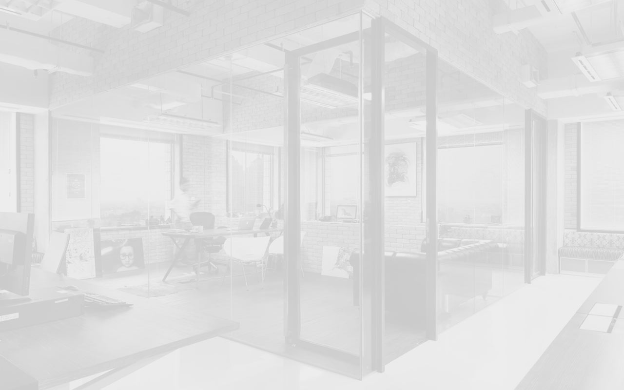
Interactive images presentation by JSN ImageShow extension
All JoomlaShine.com templates have special built-in design optimized for modern mobile devices iPhone, Android and Windows Mobile-based. The responsive design is applied for both Joomla 2.5 and 3.0 versions, and for Pro Edition only.
Unlike other template providers, we do not develop something that looks like a mobile app with heavy menu and animation. We built compact and lightweight version of the template preserving the whole original look-and-feel.
Mobile layout overview on Iphone

Mobile layout overview

Module positions in mobile layout
As default, all modules will be displayed on both desktop and mobile. To display a module on only desktop or on only mobile, you can add Module Class Suffix parameter as following:
- Display a module on only desktop: display-desktop
- Display a module on only mobile: display-mobile
Mobile layout overview on Ipad

Mobile layout overview on Ipad
Optimized HTML overrides for mobile

Article presentation (com_content)

News feeds presentation (com_newsfeeds)
We optimized HTML overrides for all default Joomla! extensions to make them looks neat in mobile edition. The work is mainly focused on rearrangement content from columns to rows.
Optimized menu for mobile
For mobile edition, we have built very simple, yet effective menu system, where all children menu items are presented as tree in collapsible panel. This menu system utilizes only little Javascript (MooTool) for expanding/collapsing submenu panels and is very fast and lightweight.

Special designed mobile menu system

Children menu items are presented as tree
Mobile Menu with icons and rich text
The most amazing thing is mobile menu inherits all the goodies of regular menu like icons and rich text.
Mobile menu with icons applied

Mobile menu with rich text
The responsive feature is enabled on live demo. You can check this by resizing the demo to the desired size and see how it presents on mobile devices.

JSN Epic is natively compatible with both Joomla! 2.5 and Joomla! 3.x. The installation package is compatible with both Joomla CMS.

In Customer Area, you can choose to download appropriate installation file for the Joomla! version you are using.
The image gallery you see on this website is the Free Edition of another cool product JSN ImageShow from JoomlaShine. Please click on the below button to check the PRO Edition of this extension.
This product is shipped with component, module and content plugin, so you can place it anywhere on every website.
On this page you can see how JSN ImageShow is presented as module on top and as plugin in article content. With flash technology applied, you get smooth experience and consistent performance in all browsers. The JSN ImageShow also support mobile devices normally with JS/HTML version switched automatically when you visit the website.
Currently, JSN ImageShow comes with 6 themes: Theme Classic, Theme Slider, Theme Grid, Theme Carousel, Theme Strip and Theme Flow. More themes will be released in the future.


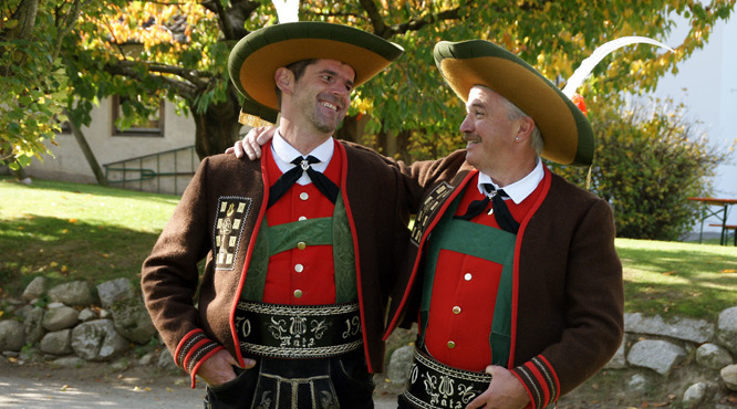
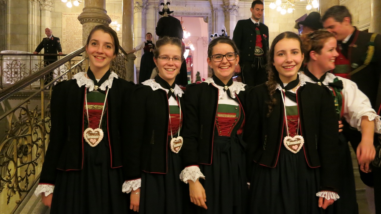
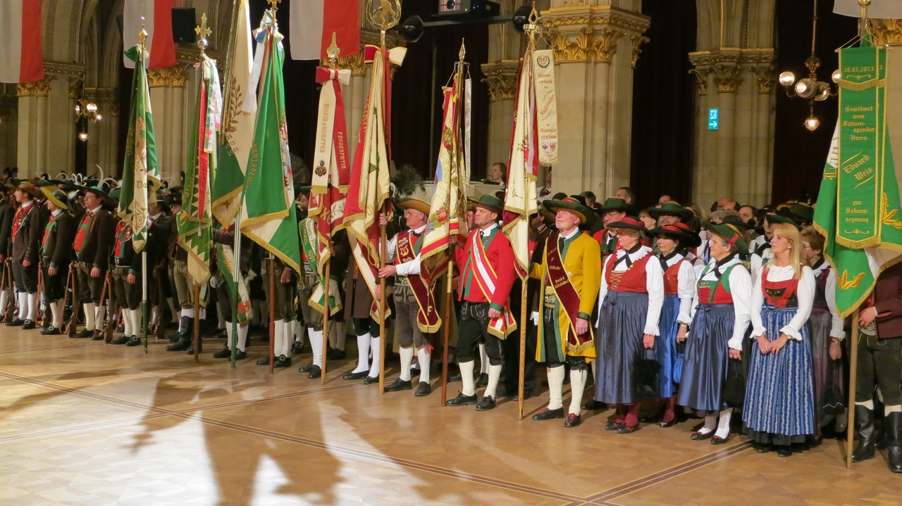
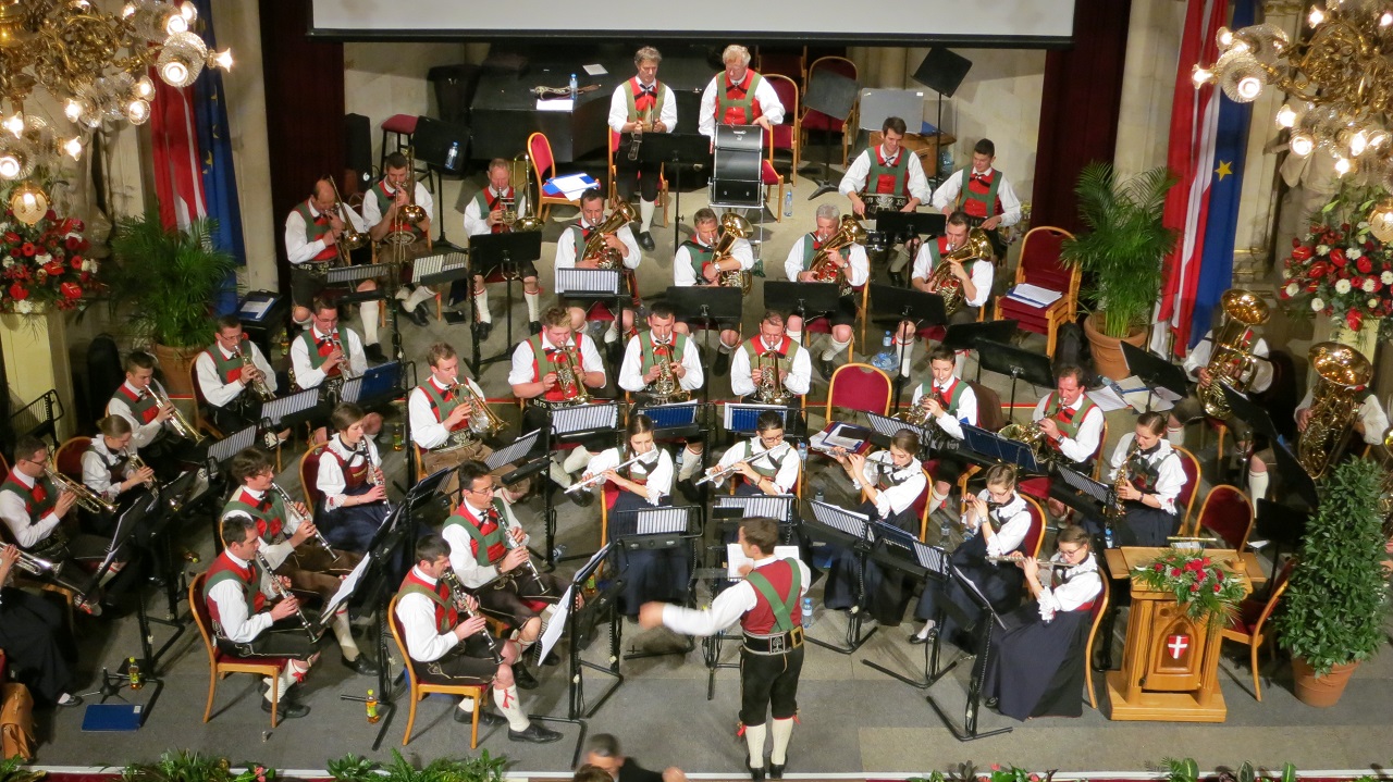
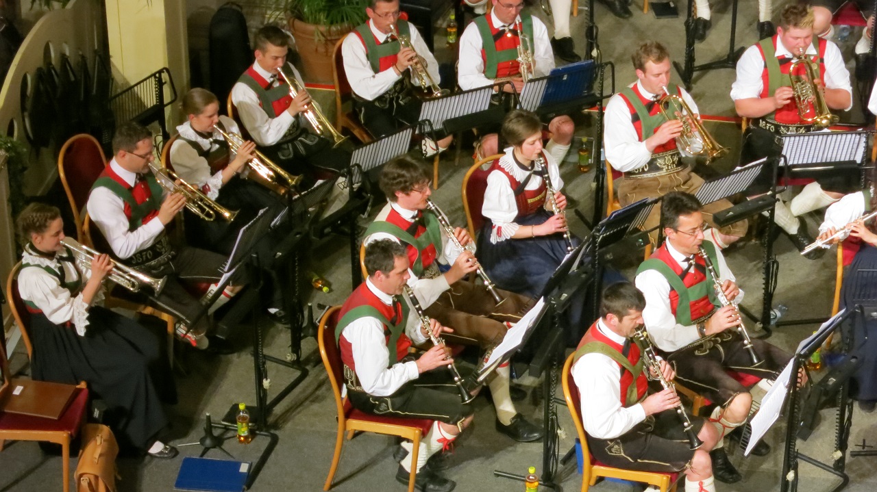
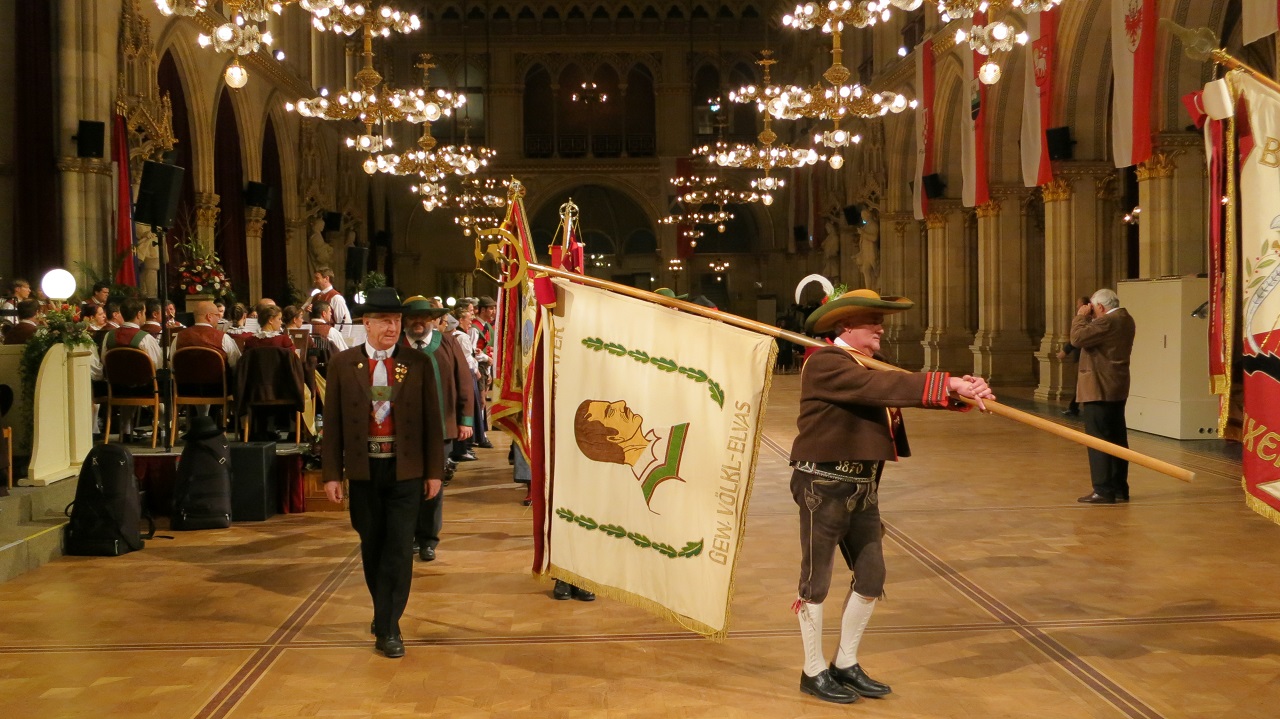
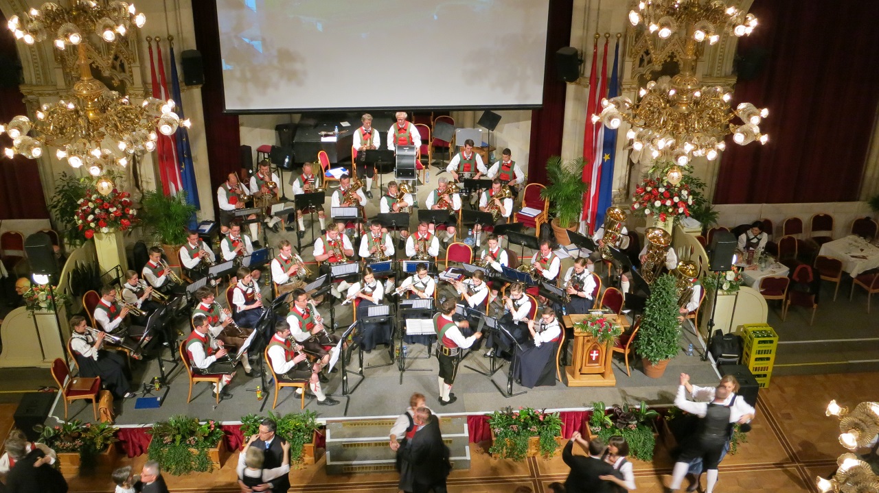
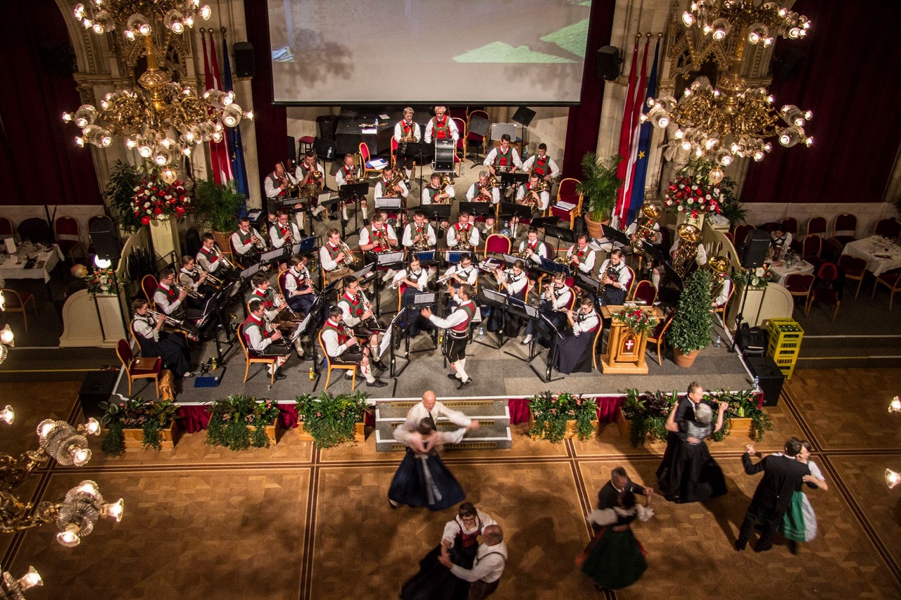
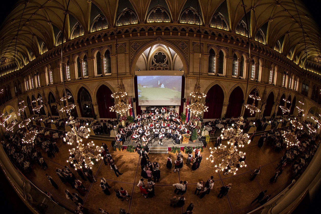
Trachtenball Wien
Wien-Trachenball-00.jpg
http://www.mk-natz.eu/images/MK-2015/Trachenball-Wien/Wien-Trachenball-00.jpg
Wien-Trachenball-07.jpg
http://www.mk-natz.eu/images/MK-2015/Trachenball-Wien/Wien-Trachenball-07.jpg
Wien-Trachenball-02.jpg
http://www.mk-natz.eu/images/MK-2015/Trachenball-Wien/Wien-Trachenball-02.jpg
Wien-Trachenball-08.jpg
http://www.mk-natz.eu/images/MK-2015/Trachenball-Wien/Wien-Trachenball-08.jpg
Wien-Trachenball-10.jpg
http://www.mk-natz.eu/images/MK-2015/Trachenball-Wien/Wien-Trachenball-10.jpg
Wien-Trachenball-11.jpg
http://www.mk-natz.eu/images/MK-2015/Trachenball-Wien/Wien-Trachenball-11.jpg
Wien-Trachenball-06.jpg
http://www.mk-natz.eu/images/MK-2015/Trachenball-Wien/Wien-Trachenball-06.jpg
Wien-Trachenball-09.jpg
http://www.mk-natz.eu/images/MK-2015/Trachenball-Wien/Wien-Trachenball-09.jpg
Wien-Trachenball-01.jpg
http://www.mk-natz.eu/images/MK-2015/Trachenball-Wien/Wien-Trachenball-01.jpg
Wien-Trachenball-03.jpg
http://www.mk-natz.eu/images/MK-2015/Trachenball-Wien/Wien-Trachenball-03.jpg
JSN ImageShow with Theme Classic
JSN ImageShow with Theme Slider
Trachtenball Wien
Wien-Trachenball-00.jpg
http://www.mk-natz.eu/images/MK-2015/Trachenball-Wien/Wien-Trachenball-00.jpg
Wien-Trachenball-07.jpg
http://www.mk-natz.eu/images/MK-2015/Trachenball-Wien/Wien-Trachenball-07.jpg
Wien-Trachenball-02.jpg
http://www.mk-natz.eu/images/MK-2015/Trachenball-Wien/Wien-Trachenball-02.jpg
Wien-Trachenball-08.jpg
http://www.mk-natz.eu/images/MK-2015/Trachenball-Wien/Wien-Trachenball-08.jpg
Wien-Trachenball-10.jpg
http://www.mk-natz.eu/images/MK-2015/Trachenball-Wien/Wien-Trachenball-10.jpg
Wien-Trachenball-11.jpg
http://www.mk-natz.eu/images/MK-2015/Trachenball-Wien/Wien-Trachenball-11.jpg
Wien-Trachenball-06.jpg
http://www.mk-natz.eu/images/MK-2015/Trachenball-Wien/Wien-Trachenball-06.jpg
Wien-Trachenball-09.jpg
http://www.mk-natz.eu/images/MK-2015/Trachenball-Wien/Wien-Trachenball-09.jpg
Wien-Trachenball-01.jpg
http://www.mk-natz.eu/images/MK-2015/Trachenball-Wien/Wien-Trachenball-01.jpg
Wien-Trachenball-03.jpg
http://www.mk-natz.eu/images/MK-2015/Trachenball-Wien/Wien-Trachenball-03.jpg
JSN ImageShow with Theme Grid

Trachtenball Wien
Wien-Trachenball-00.jpg
http://www.mk-natz.eu/images/MK-2015/Trachenball-Wien/Wien-Trachenball-00.jpg
Wien-Trachenball-07.jpg
http://www.mk-natz.eu/images/MK-2015/Trachenball-Wien/Wien-Trachenball-07.jpg
Wien-Trachenball-02.jpg
http://www.mk-natz.eu/images/MK-2015/Trachenball-Wien/Wien-Trachenball-02.jpg
Wien-Trachenball-08.jpg
http://www.mk-natz.eu/images/MK-2015/Trachenball-Wien/Wien-Trachenball-08.jpg
Wien-Trachenball-10.jpg
http://www.mk-natz.eu/images/MK-2015/Trachenball-Wien/Wien-Trachenball-10.jpg
Wien-Trachenball-11.jpg
http://www.mk-natz.eu/images/MK-2015/Trachenball-Wien/Wien-Trachenball-11.jpg
Wien-Trachenball-06.jpg
http://www.mk-natz.eu/images/MK-2015/Trachenball-Wien/Wien-Trachenball-06.jpg
Wien-Trachenball-09.jpg
http://www.mk-natz.eu/images/MK-2015/Trachenball-Wien/Wien-Trachenball-09.jpg
Wien-Trachenball-01.jpg
http://www.mk-natz.eu/images/MK-2015/Trachenball-Wien/Wien-Trachenball-01.jpg
Wien-Trachenball-03.jpg
http://www.mk-natz.eu/images/MK-2015/Trachenball-Wien/Wien-Trachenball-03.jpg
JSN ImageShow with Theme Carousel
Trachtenball Wien
Wien-Trachenball-00.jpg
http://www.mk-natz.eu/images/MK-2015/Trachenball-Wien/Wien-Trachenball-00.jpg
Wien-Trachenball-07.jpg
http://www.mk-natz.eu/images/MK-2015/Trachenball-Wien/Wien-Trachenball-07.jpg
Wien-Trachenball-02.jpg
http://www.mk-natz.eu/images/MK-2015/Trachenball-Wien/Wien-Trachenball-02.jpg
Wien-Trachenball-08.jpg
http://www.mk-natz.eu/images/MK-2015/Trachenball-Wien/Wien-Trachenball-08.jpg
Wien-Trachenball-10.jpg
http://www.mk-natz.eu/images/MK-2015/Trachenball-Wien/Wien-Trachenball-10.jpg
Wien-Trachenball-11.jpg
http://www.mk-natz.eu/images/MK-2015/Trachenball-Wien/Wien-Trachenball-11.jpg
Wien-Trachenball-06.jpg
http://www.mk-natz.eu/images/MK-2015/Trachenball-Wien/Wien-Trachenball-06.jpg
Wien-Trachenball-09.jpg
http://www.mk-natz.eu/images/MK-2015/Trachenball-Wien/Wien-Trachenball-09.jpg
Wien-Trachenball-01.jpg
http://www.mk-natz.eu/images/MK-2015/Trachenball-Wien/Wien-Trachenball-01.jpg
Wien-Trachenball-03.jpg
http://www.mk-natz.eu/images/MK-2015/Trachenball-Wien/Wien-Trachenball-03.jpg
JSN ImageShow with Theme Strip Vertical
Trachtenball Wien
Wien-Trachenball-00.jpg
http://www.mk-natz.eu/images/MK-2015/Trachenball-Wien/Wien-Trachenball-00.jpg
Wien-Trachenball-07.jpg
http://www.mk-natz.eu/images/MK-2015/Trachenball-Wien/Wien-Trachenball-07.jpg
Wien-Trachenball-02.jpg
http://www.mk-natz.eu/images/MK-2015/Trachenball-Wien/Wien-Trachenball-02.jpg
Wien-Trachenball-08.jpg
http://www.mk-natz.eu/images/MK-2015/Trachenball-Wien/Wien-Trachenball-08.jpg
Wien-Trachenball-10.jpg
http://www.mk-natz.eu/images/MK-2015/Trachenball-Wien/Wien-Trachenball-10.jpg
Wien-Trachenball-11.jpg
http://www.mk-natz.eu/images/MK-2015/Trachenball-Wien/Wien-Trachenball-11.jpg
Wien-Trachenball-06.jpg
http://www.mk-natz.eu/images/MK-2015/Trachenball-Wien/Wien-Trachenball-06.jpg
Wien-Trachenball-09.jpg
http://www.mk-natz.eu/images/MK-2015/Trachenball-Wien/Wien-Trachenball-09.jpg
Wien-Trachenball-01.jpg
http://www.mk-natz.eu/images/MK-2015/Trachenball-Wien/Wien-Trachenball-01.jpg
Wien-Trachenball-03.jpg
http://www.mk-natz.eu/images/MK-2015/Trachenball-Wien/Wien-Trachenball-03.jpg
JSN ImageShow with Theme Strip Horizontal
Trachtenball Wien
Wien-Trachenball-00.jpg
http://www.mk-natz.eu/images/MK-2015/Trachenball-Wien/Wien-Trachenball-00.jpg
Wien-Trachenball-07.jpg
http://www.mk-natz.eu/images/MK-2015/Trachenball-Wien/Wien-Trachenball-07.jpg
Wien-Trachenball-02.jpg
http://www.mk-natz.eu/images/MK-2015/Trachenball-Wien/Wien-Trachenball-02.jpg
Wien-Trachenball-08.jpg
http://www.mk-natz.eu/images/MK-2015/Trachenball-Wien/Wien-Trachenball-08.jpg
Wien-Trachenball-10.jpg
http://www.mk-natz.eu/images/MK-2015/Trachenball-Wien/Wien-Trachenball-10.jpg
Wien-Trachenball-11.jpg
http://www.mk-natz.eu/images/MK-2015/Trachenball-Wien/Wien-Trachenball-11.jpg
Wien-Trachenball-06.jpg
http://www.mk-natz.eu/images/MK-2015/Trachenball-Wien/Wien-Trachenball-06.jpg
Wien-Trachenball-09.jpg
http://www.mk-natz.eu/images/MK-2015/Trachenball-Wien/Wien-Trachenball-09.jpg
Wien-Trachenball-01.jpg
http://www.mk-natz.eu/images/MK-2015/Trachenball-Wien/Wien-Trachenball-01.jpg
Wien-Trachenball-03.jpg
http://www.mk-natz.eu/images/MK-2015/Trachenball-Wien/Wien-Trachenball-03.jpg
JSN ImageShow with Theme Flow
Mobile optimized
For mobile device, we have built special lightweight Javascript version, so you can be absolutely sure about images presentation.

Mobile optimized presentation (screenshot made by iPhone 3GS)