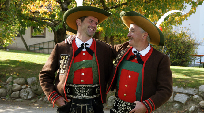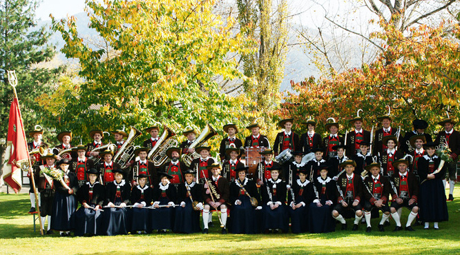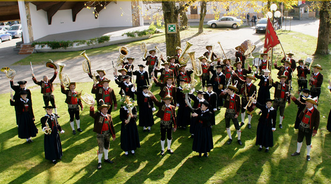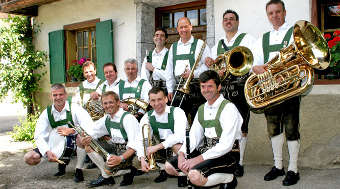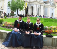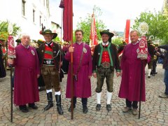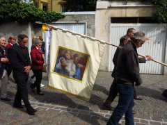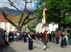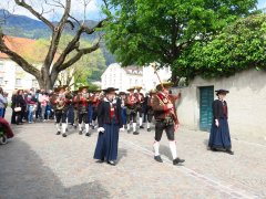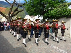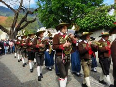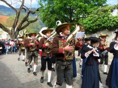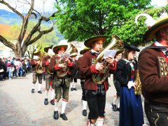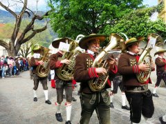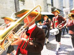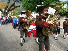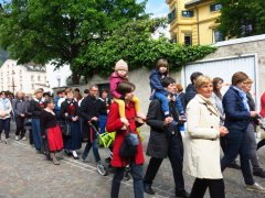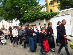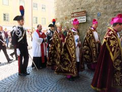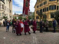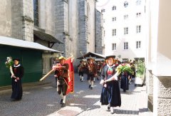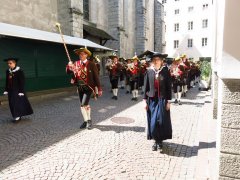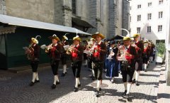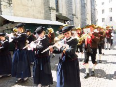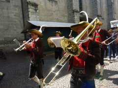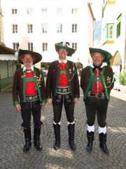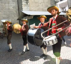
Kassiansprozession Brixen 2017
Kasiansprozession-2017
IMG_7274.JPG
http://www.mk-natz.eu/images/MK-2017/Kassians-Prozession-2017/IMG_7274.JPG
IMG_7292.JPG
http://www.mk-natz.eu/images/MK-2017/Kassians-Prozession-2017/IMG_7292.JPG
IMG_7268.JPG
http://www.mk-natz.eu/images/MK-2017/Kassians-Prozession-2017/IMG_7268.JPG
IMG_7283.JPG
http://www.mk-natz.eu/images/MK-2017/Kassians-Prozession-2017/IMG_7283.JPG
IMG_7294.JPG
http://www.mk-natz.eu/images/MK-2017/Kassians-Prozession-2017/IMG_7294.JPG
IMG_7328.JPG
http://www.mk-natz.eu/images/MK-2017/Kassians-Prozession-2017/IMG_7328.JPG
IMG_7512.JPG
http://www.mk-natz.eu/images/MK-2017/Kassians-Prozession-2017/IMG_7512.JPG
IMG_7518.JPG
http://www.mk-natz.eu/images/MK-2017/Kassians-Prozession-2017/IMG_7518.JPG
IMG_7526.JPG
http://www.mk-natz.eu/images/MK-2017/Kassians-Prozession-2017/IMG_7526.JPG
IMG_7530.JPG
http://www.mk-natz.eu/images/MK-2017/Kassians-Prozession-2017/IMG_7530.JPG
IMG_7534.JPG
http://www.mk-natz.eu/images/MK-2017/Kassians-Prozession-2017/IMG_7534.JPG
IMG_7536.JPG
http://www.mk-natz.eu/images/MK-2017/Kassians-Prozession-2017/IMG_7536.JPG
IMG_7538.JPG
http://www.mk-natz.eu/images/MK-2017/Kassians-Prozession-2017/IMG_7538.JPG
IMG_7540.JPG
http://www.mk-natz.eu/images/MK-2017/Kassians-Prozession-2017/IMG_7540.JPG
IMG_7940.JPG
http://www.mk-natz.eu/images/MK-2017/Kassians-Prozession-2017/IMG_7940.JPG
IMG_7542.JPG
http://www.mk-natz.eu/images/MK-2017/Kassians-Prozession-2017/IMG_7542.JPG
IMG_7545.JPG
http://www.mk-natz.eu/images/MK-2017/Kassians-Prozession-2017/IMG_7545.JPG
IMG_7548.JPG
http://www.mk-natz.eu/images/MK-2017/Kassians-Prozession-2017/IMG_7548.JPG
IMG_7841.JPG
http://www.mk-natz.eu/images/MK-2017/Kassians-Prozession-2017/IMG_7841.JPG
IMG_7868.JPG
http://www.mk-natz.eu/images/MK-2017/Kassians-Prozession-2017/IMG_7868.JPG
IMG_7053.JPG
http://www.mk-natz.eu/images/MK-2017/Kassians-Prozession-2017/IMG_7053.JPG
IMG_7916.JPG
http://www.mk-natz.eu/images/MK-2017/Kassians-Prozession-2017/IMG_7916.JPG
IMG_7922.JPG
http://www.mk-natz.eu/images/MK-2017/Kassians-Prozession-2017/IMG_7922.JPG
IMG_7926.JPG
http://www.mk-natz.eu/images/MK-2017/Kassians-Prozession-2017/IMG_7926.JPG
IMG_7934.JPG
http://www.mk-natz.eu/images/MK-2017/Kassians-Prozession-2017/IMG_7934.JPG
IMG_7939.JPG
http://www.mk-natz.eu/images/MK-2017/Kassians-Prozession-2017/IMG_7939.JPG
IMG_7913.JPG
http://www.mk-natz.eu/images/MK-2017/Kassians-Prozession-2017/IMG_7913.JPG
IMG_7941.JPG
http://www.mk-natz.eu/images/MK-2017/Kassians-Prozession-2017/IMG_7941.JPG
Advanced Stuff
JSN Epic has some great features to improve your website visibility to search engines and audience with disabilities. All these SEO features are not new, but they are built-in the template and you do not have to install any additional extensions.
Source ordering

One of the most important SEO techniques is to make sure that search engine can find your critical content before others. To make this possible in our template code structure we generate the “center” part first and only after that “left” and “right” columns.
In this way, you can be sure that search engines will see your critical content first. You can use Lynx browser both online or offline to make sure of that.
Website Title

This feature allows you to use value defined in parameter Site Name from Joomla Global Configuration and show it in tag <title> on every pages. By default Joomla! presents Site Name only at back-end and offline page. Now, with parameter Website Title you can utilize Site Name at front-end on every page. This is great feature to improve your website SEO, since you can define a website title with some important keywords and show it on every page.
Top H1 tag

This feature allows you to wrap website slogan to <h1> tag, which is good for both SEO and accessibility. As we all know, <h1> is the most important content tag and search engine normally pays special attention to the content in that tag. Once you configured your keyword-powered website title and slogan, you can include them in the first h1 tag to increase SE ranking.
All JoomlaShine templates are equipped with native RTL layout support. We spent huge amount of time tweaking every tiny details of the template to make it look absolutely awesome in RTL mode. Everything is horizontally-flipped including dropdown main menu and side menu.

(Select any menu item to get back to normal layout)
All JoomlaShine templates can be effortlessly configured by template parameters. In template setting page, you will find 40+ template parameters arranged into logical groups for convenient operation.

Set parameters without confusion
Most parameters are designed that way that you can simply select options without confusion about what value to define. All parameters are equipped with description text for easier understanding.

Parameters to control layout dimensions

Parameters to control colors & styles

Parameters to control mobile settings
In our templates all wordings of both back-end and front-end are moved to separated language files, so you can easily translate them into any language you want.
Interactive images presentation by JSN ImageShow extension
All JoomlaShine.com templates have special built-in design optimized for modern mobile devices iPhone, Android and Windows Mobile-based. The responsive design is applied for both Joomla 2.5 and 3.0 versions, and for Pro Edition only.
Unlike other template providers, we do not develop something that looks like a mobile app with heavy menu and animation. We built compact and lightweight version of the template preserving the whole original look-and-feel.
Mobile layout overview on Iphone

Mobile layout overview

Module positions in mobile layout
As default, all modules will be displayed on both desktop and mobile. To display a module on only desktop or on only mobile, you can add Module Class Suffix parameter as following:
- Display a module on only desktop: display-desktop
- Display a module on only mobile: display-mobile
Mobile layout overview on Ipad

Mobile layout overview on Ipad
Optimized HTML overrides for mobile

Article presentation (com_content)

News feeds presentation (com_newsfeeds)
We optimized HTML overrides for all default Joomla! extensions to make them looks neat in mobile edition. The work is mainly focused on rearrangement content from columns to rows.
Optimized menu for mobile
For mobile edition, we have built very simple, yet effective menu system, where all children menu items are presented as tree in collapsible panel. This menu system utilizes only little Javascript (MooTool) for expanding/collapsing submenu panels and is very fast and lightweight.

Special designed mobile menu system

Children menu items are presented as tree
Mobile Menu with icons and rich text
The most amazing thing is mobile menu inherits all the goodies of regular menu like icons and rich text.![]()
Mobile menu with icons applied

Mobile menu with rich text
The responsive feature is enabled on live demo. You can check this by resizing the demo to the desired size and see how it presents on mobile devices.
